The Looping Display Is Not a Complete Story
A looping display needs more than a repeated message. Learn how sequence, duration, and context help viewers understand what to do and why it matters.
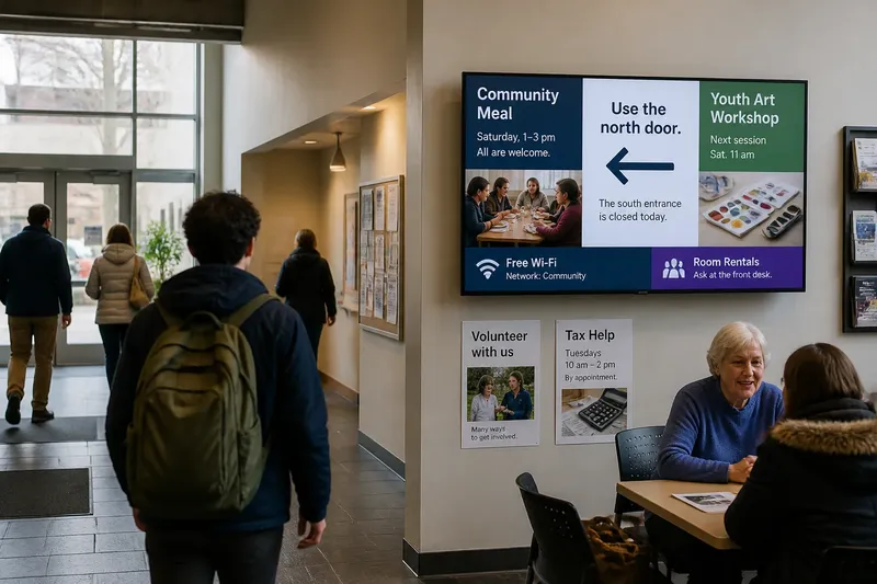
You walk into a library lobby just as a screen changes from a photograph of a closed side entrance to the words “Use the north door.” The message feels clear until you notice that the photograph has vanished, and the instruction appears between several unrelated notices. A looping display can repeat every item faithfully and still leave people guessing. Its meaning depends on what viewers see before and after a message, how long it stays visible, and what is happening around the screen.
If you are designing a looping display, treat it as a sequence that people encounter partway through, not as a short film everyone watches from the beginning. The right design depends on the viewing situation. A person passing through a hallway needs a different kind of message from someone waiting in a community room. The decisions below help match the loop to that situation.
Start with the way people encounter the looping display
Before arranging slides, identify what viewers are doing near the screen. Are they walking past, waiting, meeting, or returning regularly? Can they see the display from a distance? Does a person have time to read a second screen in the sequence? These are practical design questions, not background details. They determine whether a message can rely on a previous frame or must make sense on its own.
Also consider how much of the audience will arrive after a loop has started. In most shared spaces, viewers enter and leave at different times. A person who sees only one segment may never see its setup or explanation. A sequence that works for a seated audience attending from the beginning can fail in a corridor where each person catches a different slice.
List the audience’s likely actions beside the display, such as finding a room, checking an opening time, or deciding whether to join an event. Then ask what the screen should help them do. If the purpose is simply to establish a mood or show community artwork, a message may not need a practical next step. If someone must act, the screen should name that action clearly.
Use self-contained messages for people who keep moving
A hallway, entrance, or service counter usually favors independent messages. Each one should carry the information needed to understand it without relying on the item immediately before it. A notice about a changed meeting location, for instance, should state the event, the new location, and any relevant timing together. A later slide can add detail, but it should not supply a missing noun or condition.
Use direct wording and a clear visual order. Give the main point the strongest position, then place supporting details beneath or beside it. A directional arrow should sit close to the destination it indicates; an arrow near a photograph may otherwise look like part of the image. Keep decorative motion from competing with the wording, especially when viewers have only a brief glance.
Suppose a neighborhood center wants visitors to know that a craft table has moved from the lobby to the back room. A self-contained slide could name the activity, state “Back room,” and show an arrow pointing toward the hallway. A visitor who sees that single slide can act without waiting for the loop to return to an earlier explanation.
For a passing audience, make each item understandable at first contact.
Build a sequence only when the parts genuinely depend on one another
A sequence can help explain a process or make a complicated point easier to follow. It works when the relationship between its parts is clear: a question followed by an answer, a location followed by directions, or a claim followed by a reason. Merely placing several related images together does not make them a story. Viewers need cues that show how one item connects to the next.
Use a visible structure rather than assuming people will infer it. Labels such as “What changed,” “Where to go,” and “Who can help” can orient a viewer who joins midway. If the items must be seen in order, say so and explain why the screen is arranged that way. In a space where people cannot wait for the first slide, consider adding a brief standalone summary before the sequence or making each segment intelligible by itself.
Sequence is a poor fit when a viewer needs one fact immediately. A direction, a temporary closure, or a current service instruction should not be hidden behind an opening scene or the first part of a multi-slide explanation. Put the necessary information where it is likely to appear quickly, or display it persistently if the screen format supports that choice.
Think of sequence as a tool for showing relationships, not as a reason to split one sentence across several frames.
Give each message enough visible time to be understood
Duration is the time an item remains on screen. It affects more than reading speed. Viewers need time to notice that the screen has changed, locate the main point, read the supporting details, and connect the text with any image or symbol. A slide that flashes by may technically appear in every loop yet remain functionally invisible.
Judge duration by the content and viewing conditions. A short phrase in a quiet waiting area may be easy to absorb. A notice with several lines, unfamiliar names, or a map asks for more attention. So does a screen viewed from across a busy lobby, where movement and conversation compete with reading. Remove details that do not help the viewer decide or understand before simply extending the display time.
When a message contains information people may need to retain, give them a way to revisit it. A printed notice, a clearly identified web page, or a staff contact can supplement the screen. Do not make a small code the only route to essential information if some viewers cannot or do not want to use a phone.
Ask someone unfamiliar with the message to glance at the display under ordinary conditions. Invite them to say what it is asking them to know or do. If they miss the central point, revise the wording or visual order before relying on a longer hold.
Match context to the place and the moment
Context includes the physical setting, the audience’s expectations, and the timing of the message. A slide about a community meal means something different near the entrance before the event than on a screen in a room where the meal has already begun. A photograph may identify a familiar landmark to regular visitors but offer little help to newcomers.
Connect the screen to its surroundings. Use place names that match signs in the building. If directions refer to “the north door,” make sure the location is recognizable from where viewers stand. Avoid relying on color alone to distinguish categories, since the display may be seen under changing light or by people with different visual needs. Pair color with words, icons, or layout.
Timing also affects whether information feels current. A message about a change should make its effective period clear when that detail matters. Remove or update it when the situation changes; a repeating notice can make old information seem newly confirmed each time it returns. Assign someone responsibility for checking the content as part of the screen’s ordinary upkeep.
Where a message depends on building policy, a service provider’s directions, or local requirements, check the relevant source before displaying it.
Choose the display approach that fits your audience?
Should every slide make sense on its own?
Usually, yes, when people pass the screen or arrive at unpredictable times. Use a connected sequence only when the relationship between items adds meaning, and give viewers a way to understand the essential point without having watched the opening.
How long should a message stay on screen?
Long enough for a viewer in the actual space to notice, read, and understand its main point. Dense wording, distant viewing, or competing activity calls for simplification or more time; there is no single duration that fits every display.
Can images tell the story without explanatory text?
Images can communicate mood, place, and recognizable activity, but they may not identify a specific action or condition. Add concise text whenever viewers need to distinguish between similar places, understand a change, or know what to do next.
What should a viewer do after seeing an important notice?
State the next action in plain language, such as following a named direction, asking at a desk, or checking a clearly named resource. If no action is expected, make the information’s purpose clear so viewers do not mistake an announcement for an instruction.
Review the loop from the middle, not only from the beginning
Designers often preview a sequence from its first frame, where every transition feels intentional. A viewer arriving at a random point has no such advantage. Review the display as if you had just entered the room: start with an interior slide, then ask whether you can tell what it concerns and whether its connection to the next item is evident.
Also check for accidental ambiguity. Does a photograph seem to illustrate the slide beside it, even though the two are unrelated? Does a transition make a word difficult to read? Does a heading promise an explanation that does not appear until later? These small mismatches can change the message people take away.
Imagine a volunteer team preparing a loop for a shared hall. Their draft begins with a title slide, then shows a poster for a Saturday repair gathering, followed by a map that uses the phrase “the west entrance.” They ask a new visitor to view the screen starting at the map. The visitor understands where to enter but cannot tell which event the map serves. The team adds “For the Saturday repair gathering” to the map slide and labels the same entrance on a nearby printed sign. The expected result is that a viewer who joins mid-loop can connect the direction to the event without waiting for the title slide.
A looping display is a string of encounters, not a complete story delivered to a captive audience. Choose standalone messages for brief, unpredictable viewing; use a connected sequence when order clarifies a real relationship; and give context wherever the room or timing could change the meaning. When reviewing a looping display, begin with the frame a passerby might see first, not the frame you intended them to see first.